Whether you like it or not, the gender gap is still a pressing social issue. We live in an age moving towards gender equality, but where it is still not realised. Many say that need that the need for feminism has passed, and that gender equality is a reality in our society. Yet there’s still considerably less women in the top-tier jobs, and they’re still getting paid less than their male counterparts. In their talk at Berlin Buzzwords this week, Ewa Gasperowicz and Felipe Hoffa explored the gender gap using Freebase and Google BigQuery.
Freebase is an open-source database for structured data, housing over 1 billion facts about 42.9 million entities. It contains 2.4 billion ‘triples’ about these objects, which are facts composed of subject-predicate-object (for example Daft Punk-appears in- Tron). Anyone can add data to Freebase, providing it’s less than 1% duplicated or conflated with existing data. Obviously as a dataset, Freebase is massively skewed towards celebrities, but analysing this data gives us a good understanding about the men and women at the forefront of public consciousness. Gasperowicz and Hoffa used Google BigQuery to analyse and explore this 88GB dataset. Here are some of their findings.
1. The Gender Gap is Immediately Noticeable
Here’s the gender breakdown of the people notable enough to be included in Freebase:
Male: 1521700
Female: 511361
Other: 230
So there’s almost triple of the amount of notable males than notable females. Straight from the off, we can see a gender disparity, which widens when we start looking into specific professions and locations.
Interestingly, they also showed the most searched-for women on Wikipedia in real time. The top three most searched for women were:
1. Marine LePen
2. Kim Kardashian
3. Shakira
LePen’s presence can be attributed to the European elections we had that day. Other than that, we have a popstar and a woman famous for being famous. I’ll leave it up to you to decide if these are the ideal female role models to be dominating public consciousness.
2. The Gender Gap Widens in Certain Professions
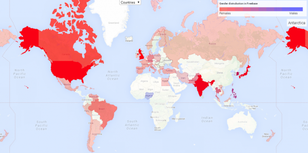
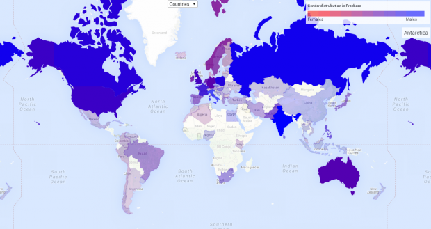
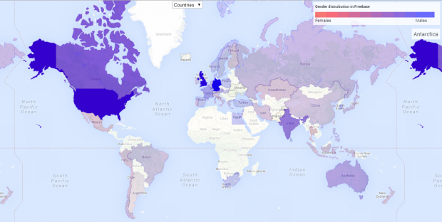
Gasperowicz & Hoffa used Google Maps to visualise the male:female ratio in jobs around the world. Red indicates dominated by females, blue dominated by males, and purple indicates balance; the intensity of the colour relates to the amount of data available. To demonstrate how profound the gender gap can be between professions, consider the visualisation for models:
3. The Gender Gap Grows- and Shrinks- at Certain Ages
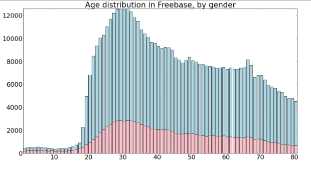
Gasperowicz & Hoffa also explored the ages of the notable males and females of Freebase. There was an obvious rift between 20-year-old males and 20-year-old females:
This was attributed to the dominance of athletes in this age category, particularly in college sports in the US.
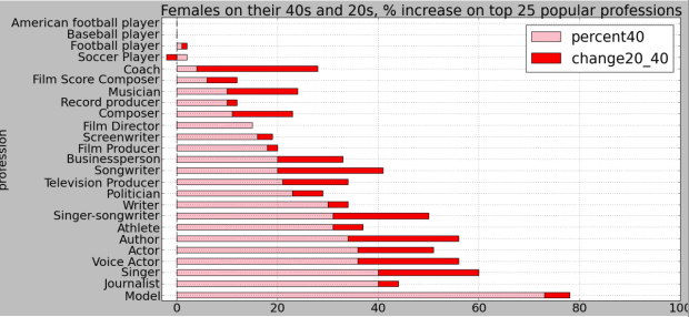
However, looking forward, there is some good news: the gender gap decreases with age. They found significantly more females in most professions aged 40 compared to age 20. It will be fascinating to see how the data changes when the current 20-year-olds hit 40 themselves.
An audience member asked if they had a map for data scientists. A cursory glance around the conference would suggest that map would be fairly blue. Hoffa replied that they did not, but that Google were committed to giving opportunties to female data scientists. Let’s hope that more companies gain an awareness of the gender gap, and that in years to come all of these maps start looking less blue and more purple.
View the presentation slides here.
Eileen McNulty-Holmes – Editor
Eileen has five years’ experience in journalism and editing for a range of online publications. She has a degree in English Literature from the University of Exeter, and is particularly interested in big data’s application in humanities. She is a native of Shropshire, United Kingdom.
Email: [email protected]
Interested in more content like this? Sign up to our newsletter, and you wont miss a thing!
[mc4wp_form]


