‘Streams in the Beginning, Graphs in the End’ is a three-part series by Dataconomy contributor and Senior Director of Product Management at Cray, Inc., Venkat Krishnamurthy – focusing on how big changes are afoot in data management, driven by a very different set of use cases around sensor data processing. In part I, we talked about a sensor-led Big Data revolution, variously referred to as the Internet of Things (and even the Internet of Everything). In part II we examined some ideas on why this revolution places a new set of demands on systems infrastructure for analytics and data management. In this next and final part, we’ll take on the ‘Graphs in the end’ idea – on why Graph-based data management will increasingly represent a key building block for sensor data processing specifically, and analytic data management in general. The fundamental power of a graph-oriented data model is its generality, which allows it to unify structural knowledge about the world, together with observational knowledge, which is the output of analytical processing.
Before we begin explaining why graphs are necessary, it’s probably worthwhile to look at the difference between 2 different kinds of data analysis.
Aggregations and Summarizations – smaller data from Big Data
The first kind is best explained, for example, with a SQL query like this, to find ‘total sales by region by product’.
SELECT region, product,

sum(sales) from

SALES_BY_REGION group

region, product
This type of aggregation query is inherently summarizing smaller observations. You’re trying to understand a large set of low-level data by characterizing it via a smaller set of computable measures like SUM, COUNT and other statistics like AVG, STDEV etc.
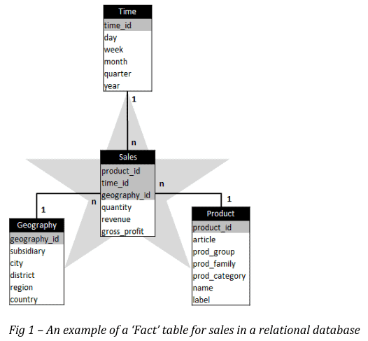
Even more important, you’ve already identified the questions you wish to ask, and likely organized the data into a table that permits this to be done efficiently and easily. In a typical relational data warehouse, you always see structures like this – called a ‘Star’ schema, where each table has some numbers (like quantity, revenue, profit) associated with a set of keys (‘dimensions’) like product, time, geography etc – like the picture here.
Investigative Analytics
Cray first entered the analytics market in 2012 with Urika-GD, by focusing on a different class of analytical problems around Investigative Analytics. Compared to ‘reductive’ kind, this analytic approach involves unifying multiple smaller analytic results into a constantly expanding, connected picture of new or updated knowledge over time. Here’s an illustration of this type of analytic approach, applied to a well-known insider trading use case in Finance (image owned by Linkurious)
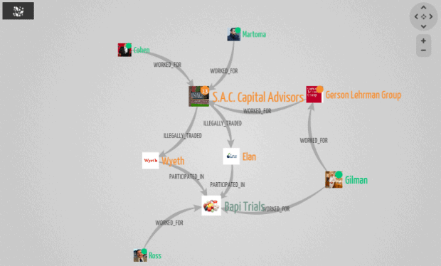
As you can see, the data management problem here is fundamentally about connecting dots as new information is found (or analyzed). In other words, you’re in the world of the Graph. Graphs are one of the most studied mathematical/data structures in computer science. The obvious ones we deal with daily are in social networks. Graphs also crop up time and again in analytics, used in recommendation engines, web page ranking and myriad other analytical techniques.
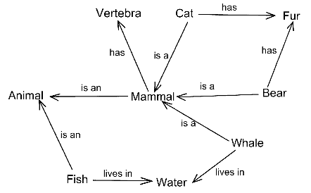
The graphs we’re dealing with here are ‘structural graphs’ that capture the composition of a particular object. Here is an example from Wikipedia:
What about ‘Graphs in the End’ as the article title states? How do sensors and event streams from part II of this article have to do with structural graphs? As always, an example will hopefully clarify this. Here’s a modern aircraft engine equipped with sensors:
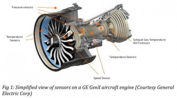
Simultaneously, we have structural knowledge about the engine itself – an engine is a complex piece of machinery with several parts. Equally, each part itself is one instance of a particular type of part, which may be used in many engines. One way of representing this structure is a model like this:
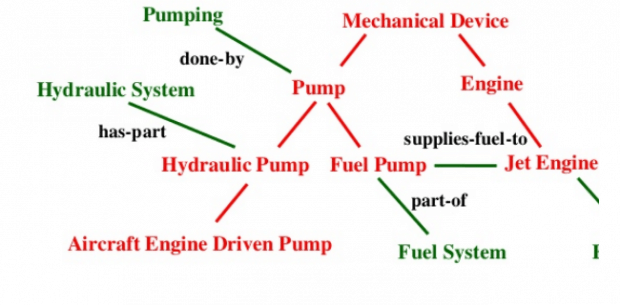
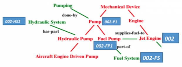
We can view this as a ‘knowledge graph’ view of the engine from Fig 1. This graph is ‘static’ – it just captures a template structure for representing information about any aircraft engines, just not a specific one (in manufacturing parlance, this is equivalent to ‘the Bill of Materials (BOM). Say this is engine #2 on a specific Boeing 787 owned by ABC Airlines. An updated version of the above picture looks like this, with the rectangles identifying specific components on engine 002.
We can then bring the sensor streams into this picture – let’s try and represent an event for a pressure reading liks this – as a combination of the specific part (in this case the fuel pump 002FP1):
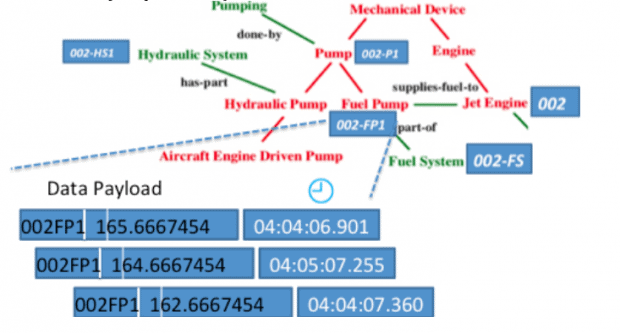
What we’ve done here (conceptually of course) is to merge 2 distinct data components. One answers the question ‘What is the structure/composition of a specific aircraft engine ’ (in this case Engine 002), while the other answers the questions around ‘What specific data (in this case a pressure reading) are we observing at fuel pump 002FP1’ on this engine.
Clearly, to understand exactly what is going on in the engine, you need both components – the structural/compositional graph of the engine and the associated event streams mapped to that graph. It makes little sense to talk of one without the other. In one sense, the above picture is actually a ‘picture drawn in data’ of the real engine.
This is only a very small part of a much larger ‘data picture’, because
- There are two engines on the aircraft, producing its own set of data streams.
- There are several aircraft in operation.
- Using the compositional graph, specific data streams can be correlated to each other.

This is not a new idea. Going back article 1, we talked about ‘Dorothy’, the machine that was used in the movie Twister to send up a barrel of sensors into a tornado. What resulted was a real-time data image of the tornado. There are a number of lower-level questions to be still considered such as
- Where does data actually live? Is the event data stream captured entirely in the graph database?
- Is a time series database specifically needed to capture event data?
- Is the data stored in the graph really the full time series of observations, or an aggregated, summarized set of outputs from the time series, associated with known nodes in the graph?
- What is the interface between the graph data store and the time series database? Is it microbatched updates or event at a time?
These are key design questions for architects.
Systems Architecture Implications
What does this all mean for our original premise? Hopefully, across parts 2 and 3 of the article, you can see the key idea develop
- Sensors are everywhere, attached to everything
- Data generated by sensors creates a large collection of data streams
- Stream processing techniques help make immediate sense of sensor data
- Structural graphs help unify these sensor streams and the outputs of analytics processing of sensor data.
From our perspective – Stream data platforms are necessary in the beginning of the analytical lifecycle for the Internet of Things. On the other end of this lifecycle, you need a scalable organizing structure for the outputs of stream processing. That structure is a graph. Hence, ‘Streams in the beginning, Graphs in the End’
What does this mean for systems architecture for data processing? It’s worthwhile to think about Hadoop in this regard. Hadoop, and the HDFS file system are both suited for a particular class of unstructured batch-oriented processing needs.
Hadoop and HDFS both emphasized having large amounts of redundant, scalable disk space.
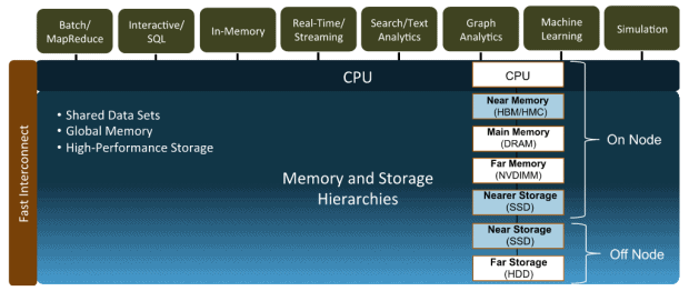
By contrast, the world of sensor data processing inverts the data collection and processing model. Rather than start at the storage layer, data processing can begin as soon as data is collected. In addition, sensor processing is usually useful only if it is real-time or near-real time. This in turn places greater emphasis on deeper memory hierarchies and faster networks (like Aries, the network on the Cray supercomputers) to handle incoming sensor data at scale.
Finally, Graph processing poses a set of new challenges for traditional and new analytical architectures. Most graph frameworks for Big Data continue to insist on first partitioning the Graph to perform distributed computation on it. This is an inherently hard problem, especially since there are no consistently good ways of doing this well. Cray’s experience with the Urika platform show that graphs result in highly irregular memory access patterns, which means techniques like caching and pre-fetching fail, resulting in unpredictable and often poor performance even in memory-centric frameworks for graphs like Spark and Flink. Also, it’s clear that the best approach for graph processing is in-memory, given its iterative nature.
As more complex use cases emerge such as graph analysis, sensor data processing and machine learning, with increasing latency sensitivity and performance requirements, we believe that future platform architectures for data processing will have deeper memory and storage hierarchies, as well as depend on faster interconnects to help realize these demands, as shown below.
Conclusion
In this series, we have defined the key needs of a platform for data management and processing driven by the sensor data revolution. We talked about how stream data processing is changing established approaches to data collection and processing by pushing analytics towards the edge where data collection occurs. In this last part of the series, we’ve outlined the idea of how graphs can be used to organize the outputs from processing a collection of sensor streams, and examined the impact on systems design for the next generation of analytics use cases and data processing. As always, we’d love your comments, feedback and insight!
Image Credit: Nick Sherman / This is a font. / CC BY-NC-SA 2.0


