Win a full license for Tableau software in their visualization challenge!
Tableau did not come from modest beginnings. It was the result of three well-prepared Stanford men. It all began when founder Chris Stolte was working on his PhD. With his background in database programming, he saw there were major problems with current data analysis tools. Stolte realized his work was clearly not just going to earn him a PhD—it was going to change data analysis. Pat Hanrahan, Stolte’s highly accomplished advisor, also saw the possibilities. Together, they began combining computer graphics with databases. Finally, they took on Christian Chabot, their entrepreneur with a background in data. The result was an international company with a jaw-dropping product that immediately won awards and garnered attention.
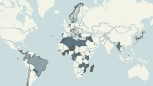
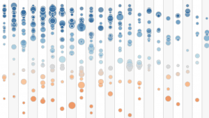
Example visualisations created with Tableau:

Kelly Martin explores the data behind improving education access for girls and the resulting health improvements.

Matt Francis uses Tableau’s Story Points feature to explain how the Sun influences Earth’s weather.

Adam McCann takes a look at how a movie director’s ratings have changed over the course of their career.
While data visualization looks nicer on a computer screen than a paper flip chart, it can be hard to master. Improper editing leaves charts looking like a high school project rather than a respectable analysis. There are numerous rules and expectations that must be adhered to.
Chart sizes and ratios must be scaled consistently and proportionately. Certain information should be found on the X-axis, rather than the Y-axis. You also need to determine what information is the most important. It’s tempting to include all of your information, though much of it is irrelevant and distracting. Conversely, you may cut too much away, leaving your visualizations feeling flimsy and incomplete. Most importantly, overly-complicated or artistic visualizations are a no-go.
A simple mis-ordering of pie segments, poorly chosen colors, and confusing chart elements are strangely common complaints about data visualizations. Even though visualization-creation seems intuitive, it’s a hard process to master. This is why apps like Tableau are important. You don’t have to understand coding, or be an expert in the field to create compelling visuals.
Tableau is designed specifically for easy use. It can integrate an array of file types and employs simple drag-and-drop technology. This means creating an infographic is as easy as dragging a few files. The product is also highly intuitive. The process is streamlined, the interface clear and clutter free. Tableau even includes practical built-in color schemes and designs, as well as suggestions. Your results can be instantly compiled into an interactive dashboard, or an image stored in the cloud
Step-by-Step
When you first open Tableau, you are greeted with introductory videos on the right hand side, as well as a “viz of the week.” These are a great starting point, and give Grade-A ideas of what you can create.
Follow on the step-by-step with Tableau’s Timo Tautenhahn, and his presentation out our event in Munich!
1. Pick your sources
The first step is to choose your data. Tableau lists all the possible sources for you to connect with on the left-hand side of the screen. Excel files, statistical data and other flat files can be accessed here. If you need to connect to a data server, it can do that, too. In fact, it can connect to any common data source—including Cloud Data, like Google Analytics. Whatever kind of data you need, Tableau will integrate it. After selecting the database, you can choose the specific data set. This narrows down what sort of information you will actually use.
Tableau automatically determines what information is a measurement and what is a dimension, and generates a sorted list.
2. Ask a question
“How has a product performed in different locations?” “Which statistics have changed over time?” Once you know your question, simply drag-and-drop the data from your data set into the column or row line. If you want to know which products are the most profitable, combining sales data with product names will show you the answer.
3. Create Visuals
The program will immediately turn that answer into a chart that opens in the same screen. You’re free to change the colors, or use the drop-down box to choose a different style of chart. You can also save it for later, and keep on creating.
4. Fill in IDs or codes
What if your data includes IDs or codes in place of proper location and product names? If you keep your ID translations in another file, you can drag and drop that information into Tableau. The program can connect that information and turn your IDs into real, meaningful locations and names.
5. Dashboard
Once your charts are finally done, you are free to drag-and-drop those into a Dashboard where they can be auto-sized and automatically aligned. The result is a presentation-ready array of visualizations.
Proof and applications
Data visualization has applications to almost every field, and Tableau has compiled an inspiringly thorough list of samples. The software can show game developers which aspects of a game are popular, who is playing, and which characters are most liked. Pharmaceutical companies can analyze new products, current trends and their marketing performance. Organisations, or even individuals, can use Tableau to create visualisations highlighting startling inequality, political differences, crime rates or poverty figures – leveraging data for social good.
Looking at the government sector, it becomes clear how multi-faceted the Tableau tools are. Analyzing government data is a hugely daunting task. Data can span over a billion rows, and seems impossible to effectively analyze or understand.
Tableau, however, shows how proper programs can turn overwhelming data into useful information. To this end, they share a health infographic, reportedly compiled and created from a million-row national health database in less than an hour. The aim of the infographic is to understand obesity rates, and display them in a practical yet highly thorough manner. The viewer starts by selecting a state from the drop-down box. The infographic breaks down the data for that state’s counties, comparing factors like exercise, fruit and vegetable consumption, and smoking. These factors are also compared to other counties, and national averages. In a matter of moments, millions of rows of data take on meaning and become applicable. It becomes clear which counties need the most attention, and which counties may be good role models.
Crunching the Numbers
Tableau is a big name with few alternatives that can do everything it does. It’s a leading competitor that is practical for huge businesses and small endeavors, alike. Compared to other softwares, it is the most intuitive. It is revered for its ability to let you play with information. It gives you all the tools to explore your data with a simple drag and drop. It’s ideal for learning from your data as well as quick and effective sharing.
The company is also known for regular technology upgrades, as well as strong community building. They’ve even topped Gartner’s Magic Quadrant for three years in a row, marking Tableau as a good product, popular name, and strong developer.
Sample, Create and Win
Tableau has further sweetened the pot, and is offering the full version of Tableau for a one-month free trial.
The datacurious can use this time to enter Tableau’s infographic competition. The goal of the competition is to create the best data visualization. Entries should be submitted by email to [email protected], and will be posted to Dataconomy where they will be judged by a community of true data lovers. The most popular share by social impact, wins. Apart from the spirit of competition, participation also allows you to get your feet wet and see what you can do with data visualization. If you consider yourself a data pro, you can also see how your graphics measure up. The winning designer will receive a full Tableau license, business or individual.
So what are you waiting for, get visualizing. Submit your finished visualizations to [email protected] to enter!


