- Quick take: Google is rolling out a suite of updates across its mobile ecosystem, including a new Android logo and improvements to various apps, as it prepares for the imminent release of Android 14.
- Core insight: The tech giant is enhancing user experience through incremental updates to its mobile services and apps, while also unveiling a new Android logo to strengthen brand consistency.
- What’s next: With an annual hardware event on the horizon and the expected launch of Pixel 8 and Android 14, Google is positioned to continue its trend of offering incremental yet impactful updates, making the Android experience ever more seamless and unified.
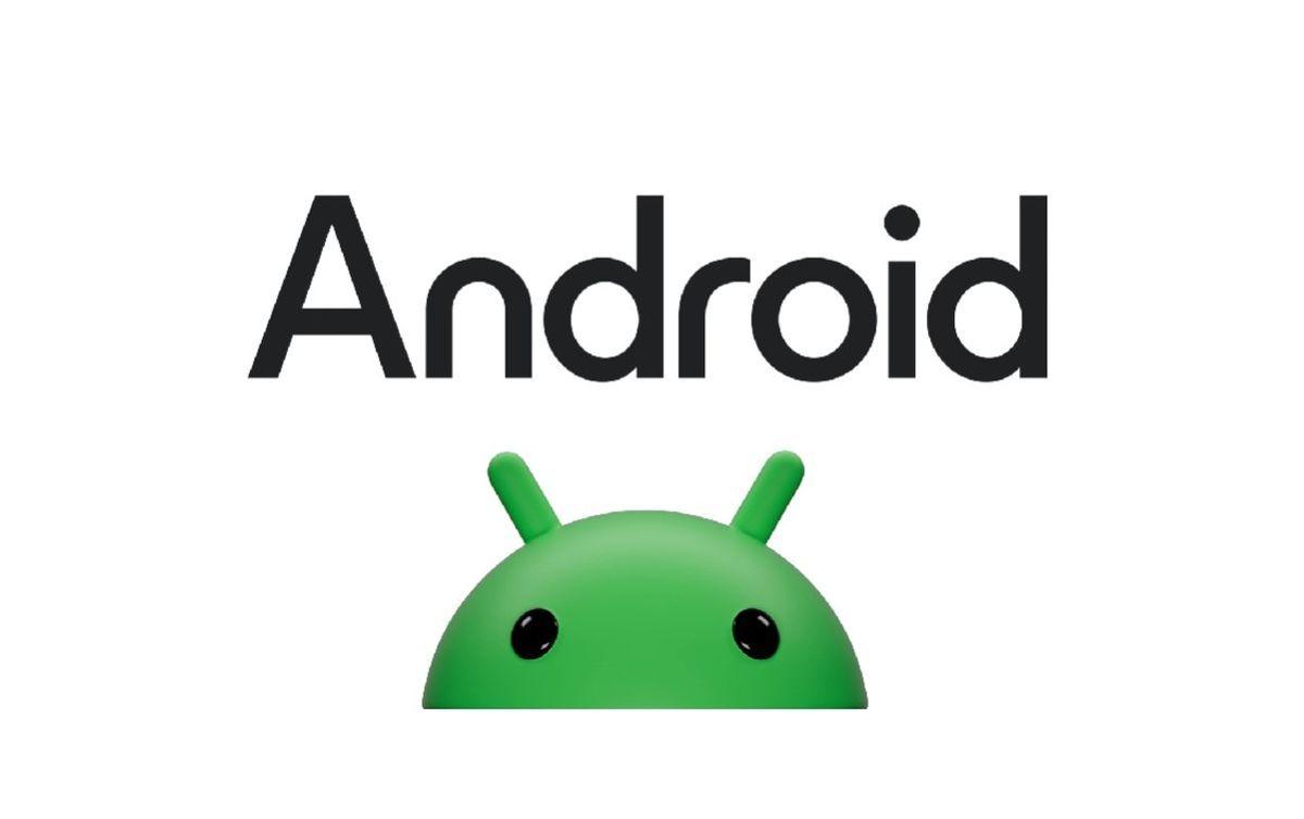
As Google gears up for the Android 14 launch, the tech giant is not only rolling out a variety of mobile enhancements but also introducing a new Android logo. This refreshed design captures Android’s unique blend of playfulness and robust functionality, embodying the essence of a comprehensive Google product.
These updates range from a revamp of the At a Glance Google Assistant widget to sprucing up the Lookout visual accessibility app, and yes, even bringing Zoom calls to Android Auto.
The new Android logo debuted
Before you yawn at the mention of Android 14—often these major versions don’t bring as much new stuff as you’d think—it’s worth noting that Google’s strategy has been to incrementally roll out most new Android features throughout the year. This ensures that your Android experience is consistently updated, rather than making you wait for one colossal, annual OS update.

At a glance
Amidst all the buzz around Google’s new Android logo and the upcoming Android 14, let’s dive into what these updates mean for the apps and services you use daily. The At a Glance widget isn’t just getting a makeover; it’s evolving into a more insightful companion. Soon, it will not just remind you about Aunt Clara’s birthday but will keep you posted about local weather and any upcoming trips.
Google supercharges Duet AI for DevOps
Google Wallet
Now, let’s chat about Google Wallet, another app that’s becoming more user-friendly. Gone are the days when uploading barcoded passes felt like a scavenger hunt. With the newly added photo import feature, it’s as simple as snap and upload.
What changed in the logo?
Ready for a refresh? Google’s new Android logo is leading the charge in a series of updates that aim to unify the tech giant’s branding. With a typeface that harmonizes with Google’s primary logo and a capitalized ‘A’ in Android, Google is sealing the deal on its brand consistency.

But wait, there’s more—our favorite green bot is getting a dimensional upgrade. Expect to see it pop up in various 3D avatars, replete with textures and colors to suit different occasions. And while we appreciate the novelty, we’re still on the fence about the furry iteration of the bot.
Our new visuals draw inspiration from Material design to complement the Google brand palette, as well as be adaptable. The refreshed and dynamic robot shows up where Android connects with people, community and cultural moments. It can reflect individual passions, personality and context.
The company’s journey of visual and functional updates isn’t stopping here. If you’re already eyeing the calendar for what’s next, you’re in luck. Google has sent out invites for its annual hardware event, slated for October 4th. That’s when we anticipate the grand unveiling of Pixel 8, alongside a full Android 14 release.
Featured image credit: Kerem Gülen/Midjourney


